
Design
Doodle Better Wireframes: The Postage Stamp Method
Distill a wireframe to its basics.

As a product designer at Postlight, one of my biggest challenges is designing anything from scratch. Even when working on a project with established branding/fonts/colors, staring at an empty Sketch artboard and trying to conjure something out of nothing can feel overwhelming. Light background or dark background? Should the photos get the most attention or the headlines? Should I use several smaller columns or just divide everything in half?
It’s option paralysis, like Jeremy Renner staring at the aisle of cereal boxes at the end of Hurt Locker. Except you have to design the cereal boxes, and you just wasted an hour trying to cleverly rethink the entire concept of cereal.
For me, product design is about results. Clients come to us because their business has a problem, and they want us to solve it. Ideally, that solution is elegant and beautiful, but you can spend a lot of time “exploring,” feeling really productive, and getting nothing done. Sometimes you just need to rip the band aid off and figure out how to get from A to B.
There’s a lot of design dogma passed off as gospel that tries to streamline the conceptual process by prescribing aesthetics (typically minimalist) upfront. Limit yourself to two fonts, apply a monochromatic color scheme with gratuitous amounts of whitespace, and a “correct” design is sure to emerge.
Unfortunately, in my experience, this dogma creates a situation where you force your product inside arbitrary frameworks without any thought for what the product needs or wants to do. This creates unoriginal and uncomfortable designs.
So today, I want to talk about a technique I use to assign structure to my designs from the outside-in. I use it for interfaces, but you can apply the thought process to any creative challenge.
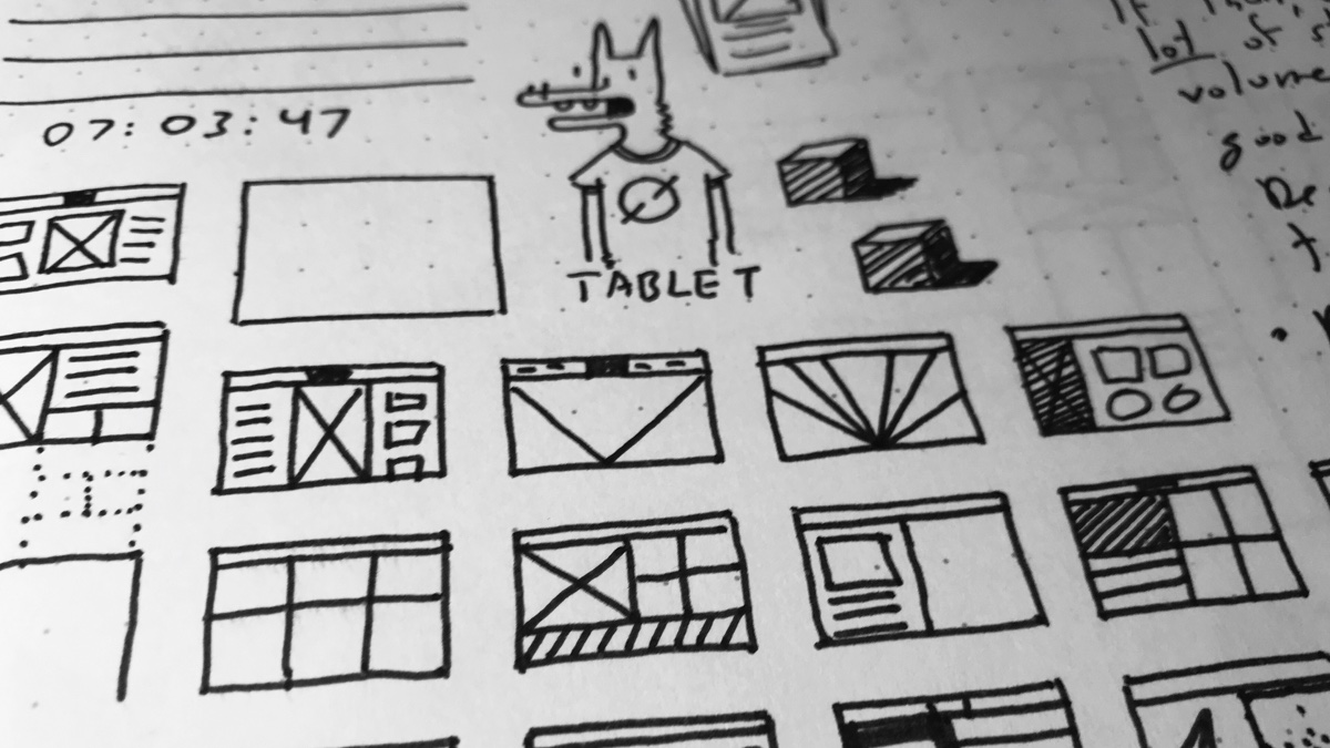
I call it the Postage Stamp method. I learned it from Jon Contino, a New York designer and illustrator. He used it to make sure his illustrations carried maximum visual impact, but I find it applies handily to UI and UX. Here’s how it works:
- Get some paper (gridded works best, but you don’t have to be fancy) and a blunt pen or pencil.
- Draw a small square or rectangle, about the size of a postage stamp.
- Using as little detail as possible, sketch a rough abstraction of your design. I’m making a website, so I’ll stick to squares and rectangles for containers and text.
- Repeat as many times as necessary. Try to find as many ways to express the essence of your design in as few shapes as possible.
That’s it! This imprecision forces me to make bold structural decisions that help keep me from sweating the small stuff. At this size, I can’t worry about fonts or shades or subtle details. All I can do is broadly decide how I want to arrange my content, and which elements deserve maximum visual priority.
Postage Stamp in Action: Liftoff
Let’s take a look at how I used this technique for my last Postlight project, Liftoff.
Liftoff is a Postlight Labs project that lets you use Airtable, a popular spreadsheet/database tool, as a CMS to generate static websites. If you know how to create a simple spreadsheet, you can create your own website. Pretty cool!
With the codebase built, I was brought on to style the default blog theme as well as create some branding for two case-study sites: the hilarious fake-pizza-review site Roni! Rony! Roné! and a simplified version of the Postlight blog.
Rather than beginning with atomic design elements like type and color and hoping they evolved into an attractive final product, I used the Postage Stamp method to block out the content in the most visually interesting way possible while maintaining hierarchy and legibility.

For Roni’s homepage, a two-column layout with a strong border made a lot of sense: it accommodated the copy and imagery well, and mimicked the layout and feel of a restaurant menu (fig. 1).
I applied the same layout to the review page. A checkerboard layout was fun in theory (fig. 2), but in practice it squished important content like the map and required redundant content like an address module.
In the end, I settled on a mix of one-column and two-column rows (fig. 3). It drew maximum attention to the most important content, the copy and review, and created a pleasing symmetry with the two-column homepage.

For Track Changes, I wanted to focus on readability, differentiate the layout from Roni, and show users how Liftoff could be adapted to a different subject matter and content.

This time, a one-column layout (fig. 1) made perfect sense for a site focused on an unobtrusive reading experience. While I didn’t use the fixed sidebar, the large scrollbar (fig. 2) was an easy way to show article progress and reinforce the text-centric nature of the site. For the homepage article list (fig. 3), I wanted to avoid copying Roni while reinforcing the blog nature of Track Changes. I decided to split the text and image of each post into two halves, but keep each post inside an obvious “card” to separate content. Even in a small sketch, I could see how the layout played well with the article page while giving the most important content the most emphasis.

Whew! I definitely didn’t think I was going to find a way to write 1000 words about doodling in my Moleskine at work. I hope this method helps you as much as it’s helped me.
Whether you’re a designer, manager, accountant, or CEO, it’s easy to get lost in the minutia of any new endeavor and over-analyze details that will ultimately become inconsequential once your plan comes into focus. The next time a large, scary, amorphous task is making you procrastinate by reading random articles online (especially the informative and entertaining articles at Postlight, wink wink nudge nudge), I urge you to get a pen and paper, sit down, and make some bold choices.
Patrick Delaney is a Product Designer at Postlight. Want to talk more about prototyping and doodling? Drop us a note: hello@postlight.com.


